The look of most pages is at the mercy of the content: If the lead photo is dominated by a shade of red that clashes with a different shade of red in an unrelated photo on the same page, well, that's the news biz and that's what we're stuck with. We can't change the shades and hues of the world just to make everything "match."
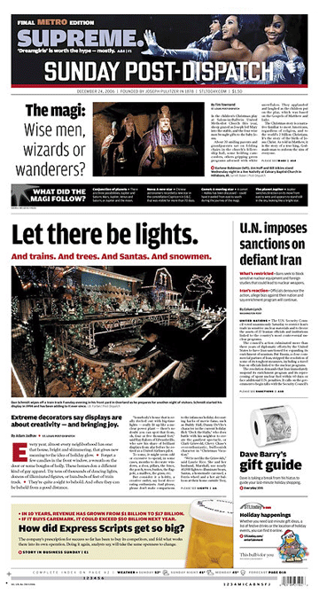
But sometimes everything aligns to produce a front page that looks like we planned it, colors and all. And it takes a savvy designer to notice this opportunity and capitalize on it. Thus was the case with this page from the Post-Dispatch, and its coordinated use of the color black throughout.
It all begins at the top of the page, with the bold use of black in the promo panel photo and the decision to reverse the nameplate. Most newspaper editors think their nameplate is sacrosanct, and shouldn't be altered for any reason. But readers don't revere our nameplates the way we do. Thank goodness. This page is noteworthy because it demonstrates how to make the nameplate an integral part of the overall design of the page, rather than a obstacle to design around.
The use of black is carried through to the panel beneath the magi story, and then into the black of the lead photo, which ironically is about light. But how better to show light than with black?
Finally, there is an inky-blackness in the bold sans serif heads throughout this page. In this case, the PD's standard typography enhances the blackness elsewhere on the page.
Room for improvement: The colors red, white and black were used very carefully throughout this page. But the peach color behind the story at the bottom seems a bit out of place. Maybe gray or a light blue echoing the top of the page would have worked more harmoniously.

• Have a nomination for the next BFD?
Send it here with your reasons why.
•
See previous BFD pages in the archives.