The new NYTimes.com is better but it's not enough. Khoi Vinh, design director at NYTimes.com, calls it “awesome.” Even more awesome is the urgent need for effective design and advertising models. Newspapers aren't changing their sites enough or fast enough.
“This site, like so many other newspaper.coms, still makes you feel like you're staring at a detailed database schema diagram on a whiteboard, says Jay Small, leader of Small Initiatives, a consumer experience consultancy.
The print edition of The Times still does a better job of conveying hierarchy than its online counterpart. Online newspapers could also show hierarchy, but most do not.
“It has lots of stuff crammed onto a bland canvas. Screen by screen, the many messages it attempts to convey are spoken at roughly the same volume. Designers rely on many different forms of contrast to create a sense of visual order that helps convey relative importance of complex information. NYTimes.com uses very little contrast,” says Small.

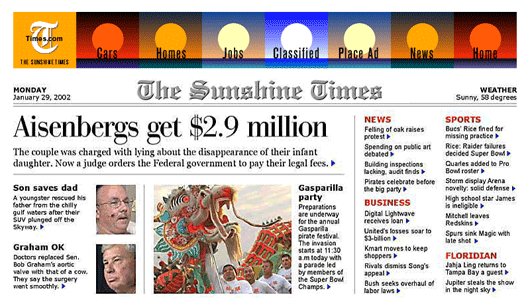
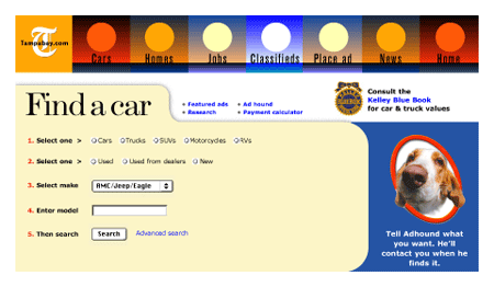
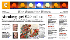
Brass Tacks has created a half-dozen alternatives to conventional websites. Here's a homepage that works like a newspaper front page and a classified search page that works with it. This design was created more than three years ago, yet contains basic features that virtually no online newspaper has yet to adopt:
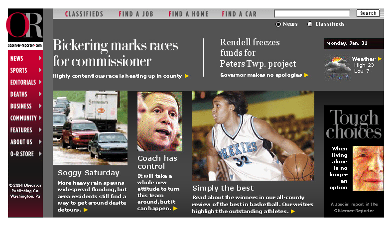
Here's another prototype for an online newspaper. It was created for the Observer-Reporter in Washington, Pa. and shares many features with the prototype above. It also offers search for the entire classified and editorial database from a single, prominently placed, anchored position at the top of the page. Because search is the killer app of online newspapers.
Both of these sites stress simplicity – the kind of simplicity that helped make Google so popular. One of the ways this simplicity is achieved is by moving ads from the homepage to interior pages.
This strategy is no different than any other publication – the front is for editorial content and the ads get great display inside. That way, the editorial content does not compete with advertising content – thus avoiding the visual confusion you see at most sites.
Online ads should not be served up willy-nilly. Instead, they should be served up in a context-sensitive manner. For instance, if someone searches for “Ford,” sites should serve up ads for Fords adjacent to the search results on the results page. Within classified pages, the context for the search determines the criteria for the ad. There's no need to serve up the ad until the context is learned, so the search page remains advertising-free and uncluttered – just like Google's search page.
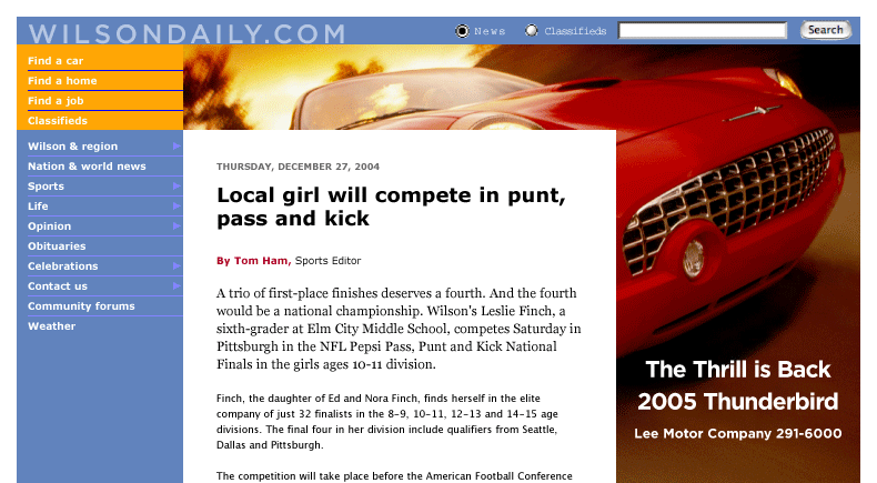
Here's an example of a bold online advertising strategy created for the online edition of The Daily Times in Wilson, NC. The homepage has no ads but the interior pages have some of the largest ads ever proposed for an online site, and one of the simplest interfaces for classified search.
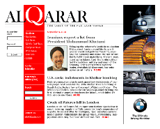
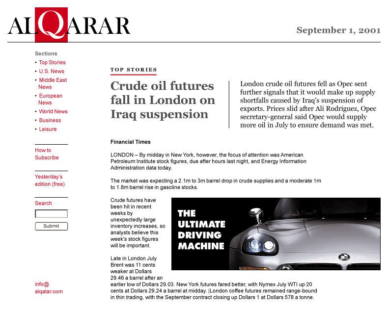
A more tradtional approach to online advertising can be seen in this prototype for Al Qarar, an online site to meet the needs of the pan-Arab community. In both cases, the interior editorial pages were designed to be attractive environments for advertising.
In a perfect world, online newspapers could take their time and produce the best possible design for their sites. But it's a world in which great papers like The Philadelphia Inquirer go begging for a buyer, and the clock is ticking ever faster.
What if Google bought Knight Ridder's dirty dozen? How long would those sites look as they do today?
“This site, like so many other newspaper.coms, still makes you feel like you're staring at a detailed database schema diagram on a whiteboard, says Jay Small, leader of Small Initiatives, a consumer experience consultancy.
The print edition of The Times still does a better job of conveying hierarchy than its online counterpart. Online newspapers could also show hierarchy, but most do not.
“It has lots of stuff crammed onto a bland canvas. Screen by screen, the many messages it attempts to convey are spoken at roughly the same volume. Designers rely on many different forms of contrast to create a sense of visual order that helps convey relative importance of complex information. NYTimes.com uses very little contrast,” says Small.
Brass Tacks has created a half-dozen alternatives to conventional websites. Here's a homepage that works like a newspaper front page and a classified search page that works with it. This design was created more than three years ago, yet contains basic features that virtually no online newspaper has yet to adopt:
- A hierarchy of news content – the top stories clearly dominate.
- A single logo for effective branding. Most sites use more than a half dozen different logos for print, online and classified products.
- Prominent, anchored links to classifieds. Automatic upsells from print classifieds comprise a significant portion of online revenue – at some sites, upsells account for virtually all revenue. And classifieds are still where the money is.
- A common user interface for all classified verticals. Unlike most newspaper sites, including the redesigned NYTimes.com, this design uses a single interface for cars, jobs, homes and classifieds. Sites like Amazon.com don't make users leap hurdles among verticals as do newspaper sites.
- All content fits within a single screen for an uncluttered look. Hundreds of links remain available through context-sensitive mouseovers. (This prototype, along with those that follow below, was built when the standard screen size was 800x600.)
- Better use of photos. Unlike most newspaper homepages, this design isn't limited to a single photo that rarely changes size, shape or position.
- A new way to display advertising. To be effective, advertising needs an uncluttered environment. Ads should be displayed prominently on interior pages, rather than competing with editorial content on the homepage.
- A newspaper look and feel. Use of newspaper-style typography for display headlines.
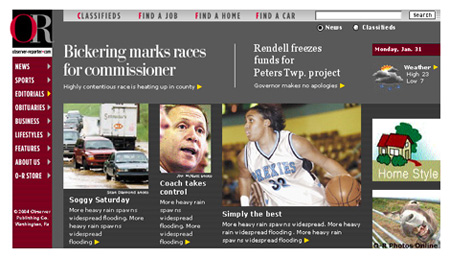
Here's another prototype for an online newspaper. It was created for the Observer-Reporter in Washington, Pa. and shares many features with the prototype above. It also offers search for the entire classified and editorial database from a single, prominently placed, anchored position at the top of the page. Because search is the killer app of online newspapers.
Both of these sites stress simplicity – the kind of simplicity that helped make Google so popular. One of the ways this simplicity is achieved is by moving ads from the homepage to interior pages.
This strategy is no different than any other publication – the front is for editorial content and the ads get great display inside. That way, the editorial content does not compete with advertising content – thus avoiding the visual confusion you see at most sites.
Online ads should not be served up willy-nilly. Instead, they should be served up in a context-sensitive manner. For instance, if someone searches for “Ford,” sites should serve up ads for Fords adjacent to the search results on the results page. Within classified pages, the context for the search determines the criteria for the ad. There's no need to serve up the ad until the context is learned, so the search page remains advertising-free and uncluttered – just like Google's search page.
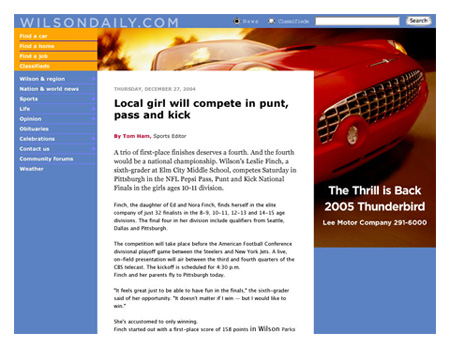
Here's an example of a bold online advertising strategy created for the online edition of The Daily Times in Wilson, NC. The homepage has no ads but the interior pages have some of the largest ads ever proposed for an online site, and one of the simplest interfaces for classified search.
A more tradtional approach to online advertising can be seen in this prototype for Al Qarar, an online site to meet the needs of the pan-Arab community. In both cases, the interior editorial pages were designed to be attractive environments for advertising.
In a perfect world, online newspapers could take their time and produce the best possible design for their sites. But it's a world in which great papers like The Philadelphia Inquirer go begging for a buyer, and the clock is ticking ever faster.
What if Google bought Knight Ridder's dirty dozen? How long would those sites look as they do today?