|
|
|
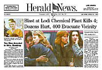
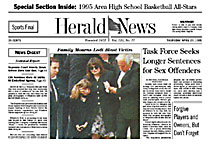
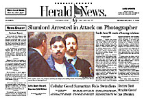
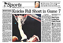
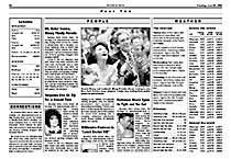
From DESIGN, Winter 1995 A publisher's perspective The redesign of the Herald & News By Richard Vezza, publisher As anyone can tell from our redesign, we've looked to the past in order to get to the future. It's also true to say we are being different simply to be different. Behind everything we've done is the unshakable feeling that the public expects something different from newspapers than they've been getting. We think it shows in people's attitudes and feelings about our industry. We came to these conclusions after studying the market research, following our instincts and talking to each other. We looked at the newspaper business – where it had been, where it was going and what was lacking from today's papers. With these conversations as a basis, we went back and read between the lines of what our readers were saying in the market research. Our work with Alan Jacobson only began after we had a clear vision of what we needed in terms of the content: what we covered, how we covered it, and finally how we presented it. While the project may have been intense and time-consuming for Alan, we were able to sum up what we wanted in a design during one 30-minute conversation with him – that's how clear our vision was. If there was one moment that crystallized our thinking, it came at a convention where I saw a display of front pages from papers across the country. Standing in front of that display, a number of things seemed stunningly apparent. Newspapers had become "graphically intense." Graphs, plenty of color, and the intricate use of type dominated front pages with plenty of devices to get the reader inside. Whenever possible, news was treated in what I term a "magazine" fashion, with a large photo or graphic and a title instead of a headline. Newspapers were caught up in an arms race of a graphic nature, competing with television, magazines, radio and every other media in an effort to wow people into buying their newspapers. Tear off the page one flags of most newspapers and try to guess which front page is which. When we looked at our own market, we saw that there wasn't anything that distinguished us from our competitors in presentation philosophy, except that they did design better than we did. Strictly from a marketing standpoint, we needed to be different. Most importantly, we had to put our emphasis on content. We believed a newspaper should be a thinking experience rather than a shared experience of amazement or entertainment. Being serious, quiet and thoughtful in today's society is probably the most radical thing you can do. In discussing our mission with Alan, we told him we wanted a design that was attractive and traditional. One that helped put the news in perspective. Most importantly, we wanted a design that told people externally and internally what they could expect when they picked up our paper. Externally, we wanted to make reading the paper a pleasant change from the rest of our readers' busy day. Internally, we wanted our editorial staff to get a strong message about our news philosophy through our design so they would know how to report, write and edit. (We're working with them in other ways as well.) We also wanted a design that wasn't labor intensive. We wanted more of our time spent on the words we put into the paper, not how they looked. The news index we wanted on page one pretty much typifies what we wanted to achieve. It contains a maximum amount of information, bereft of graphic elements. Alan looked through our papers stretching back to the 1870s and delivered a design far beyond what we imagined possible. Frankly, we were afraid that we would wind up with an imitation of a 1940s newspaper or one which was jumbled and unattractive. Alan listened carefully, fully understood our vision, and then did what good designers are supposed to do: deliver us a design that furthers the cause. The creativity in Alan's design, like our news philosophy, is quiet and requires some thought to appreciate. At the same time we implemented our redesign, we made another major decision, to reduce the web-width of our paper from the traditional 55" used at almost all newspapers to 50". As a consequence, we have a narrower paper than the traditional American broadsheet, with a printing image 12" wide instead of 13". Alan's design complements these dimensions instead of fighting it. The primary reason for reducing our web was cost reduction. But we also wanted to be first with a move we think most newspapers will follow. And we believe the narrower paper is easier for readers to handle. We get more news in the narrower paper than we did previously because many graphic elements are gone. Our headlines, photo play and bodytype are also smaller and that's also made room for more news. The feedback after a few days has been extremely positive, with the exception of a small number of complaints about the bodytype. We're making adjustments on our press and considering different paper stock and ink to address these concerns. Otherwise, the basic message we've been getting on our 800 telephone line is "thanks for giving me a newspaper." Alan's done his job extremely well. Now for the hard part: the words we put on the pages. |
|