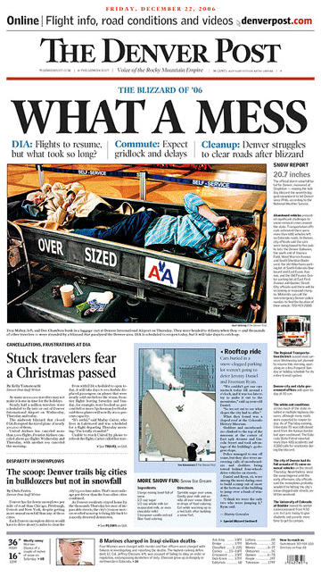
What makes this page a BFD: Excellent, story-telling photo and giving over the entire front page to a local story.
The blizzard in Colorado dominated the front pages of many papers, but The Denver Post's front page was the best. Almost all newspapers used the same photo of a snow-bound jetliner. But that photo really missed the point: No one cares about a blizzard's impact on airplanes; people only care about weather's impact on people. And this is how the Post's front page really shined – with a powerful, story-telling picture which showed the storm's impact on the people trapped at Denver International Airport. The Post went further by leading off their page with an emotional headline that summed up the feeling that everyone must have shared.
The Post devoted their entire front page to the story of the storm – as well they should have. Former Speaker of the House Tip O'Neill is famous for saying that “all politics is local.” Like a savvy pol, savvy editors know that all news is local, and no story could compare to the storm for readers in Colorado. Note the Post's treatment of the “8 Marines charged” at the bottom the page. Many papers led with this story, and on another day it may have led in Denver, but not on a day like this one.
Room for improvement: The color-coded headlines beneath the main headline provide some sense of the questions the Post's coverage will answer, but none of them direct you by page number to the answers. Most of the text elements on the page were labeled (i.e. SNOWY REPORT, DISPARITY IN SNOWPLOWS, etc.) but these labels needed to stand out more with size or color to be effective signposts.
• The overall layout of the page was modular (each element squared off) but some elements appeared to be “shoe-horned” onto the page, producing a somewhat jumbled appearance.
• The above-the-nameplate promo to useful online content appears to be separate from the storm coverage, when in fact it is an important part of it.
• Have a nomination for the next BFD? Send it here with your reasons why.
ONLINE NEWSPAPER DESIGN Read Steve Outing's interview with Alan Jacobson and learn why newspaper web sites are seriously flawed. Then see alternatives.
EDITORIAL, CLASSIFIED & ONLINE NEWSPAPER DESIGN Our redesigns are catalysts for positive change. Visit the gallery to see how we've transformed publications and websites. EDITORIAL NEWSPAPER DESIGN
NEWSPAPER DESIGN WHITEPAPER A redesign is a waste of time and money if it doesn't deliver a return on investment. Download our report to learn how to make your redesign pay off, then see how four newspapers boosted readership and revenue by following our advice. TARGETED PUBLICATIONS
INTERACTIVE TOUR See in detail how a content-driven redesign did more than make a community daily look better – it made it a better paper. RADICAL STRATEGIES FOR CIRCULATION WOES
A newspaper war, that is. The Sunday Star Times, New Zealand's largest newspaper, faces fierce competition on the newsstand from two tabloids. So it was redesigned to improve its above-the-fold presentation. The complete story will appear here and in the next issue of SND's DESIGN.
The Californian's redesign earned it a spot on Editor & Publisher's list of “Ten That Do it Right.” According to E&P, Bakersfield is appealing to its “really, really conservative market with a really, really radical redesign.”
And it’s working.
Circulation stops are down and revenue is up – over a thousand inches in the redesigned real estate section alone.
See before and after, see more pages and read the stories.
The Eureka (CA) Reporter was just a 6,000-circ. weekly in 2004. Our radical yet elegant redesign helped this startup weekly grow to a daily in less than two years. The Reporter goes head-to-head with an established daily owned by Dean Singleton, who told The San Francisco Chronicle last month that his competitor, “does some good design things.” The Society of News Design agrees – they cited this redesign as one of the best in the world. See more pages.
Len Downie's memo calls for more emphasis on design.>>
Read our abbreviated version of API's report. It'll only take a minute and it's worth it.>>
See the charts that show why now is the time to redesign for revenue.>>
A practical, step-by-step approach with examples from newspapers large and small.>>
Learn from KnightRidder's mistakes at the Inky and the Merc.>>
This online redesign is not enough to please users and advertisers.>>
Design does matter to readers, but only if it's reader driven.>>
If newspaper markets are so different,
why do most papers look so much alike?>>
I wish you luck and offer some advice.>>
This overhyped trend is a non-starter for America.>>
We can make a difference, but not by chasing awards.>>
At stake is nothing less than newspapers as we know them.>>
A thousand awards a year? Gimme a break.>>
They never said higher RBS scores would sell more newspapers.>>