What makes this page a BFD: Using white space to organize and emphasize.
The Record had a couple of odd headlines: "Sad end for Happy the sea lion" and "Bad luck for breathers" (whom does that exclude?). The San Jose Mercury News had a good "idea" for their light bulb story, much better than the Ventura County Star's.
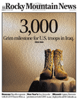
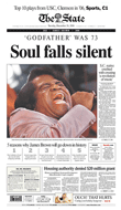
Today's nice photo notwithstanding, the new Rocky is looking more like the old Rocky every day. What up with that?
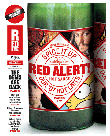
The freesheets – RedEye, Quick and Link – all used illustrations today. RedEye's was best. The Reading Eagle used two colors to create a high-impact photo-illustration.
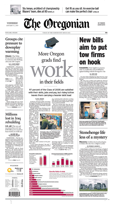
Today's best front design was seen in Portland at The Oregonian.
To be a standout, most papers need to publish something special. Today's Oregonian used white space to frame their employment package while making each element stand out, proving that negative space can be as effective as any other design element.
Send an email direct to Brass Tacks Design. Click to see all the BFDs in the archives. A selection appears below.
ONLINE NEWSPAPER DESIGN Read Steve Outing's interview with Alan Jacobson and learn why newspaper web sites are seriously flawed. Then see alternatives.
EDITORIAL, CLASSIFIED & ONLINE NEWSPAPER DESIGN Our redesigns are catalysts for positive change. Visit the gallery to see how we've transformed publications and websites. EDITORIAL NEWSPAPER DESIGN
NEWSPAPER DESIGN WHITEPAPER A redesign is a waste of time and money if it doesn't deliver a return on investment. Download our report to learn how to make your redesign pay off, then see how four newspapers boosted readership and revenue by following our advice. TARGETED PUBLICATIONS
INTERACTIVE TOUR See in detail how a content-driven redesign did more than make a community daily look better – it made it a better paper. RADICAL STRATEGIES FOR CIRCULATION WOES
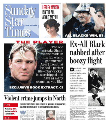
A newspaper war, that is. The Sunday Star Times, New Zealand's largest newspaper, faces fierce competition on the newsstand from two tabloids. So it was redesigned to improve its above-the-fold presentation. The complete story will appear here and in the next issue of SND's DESIGN.
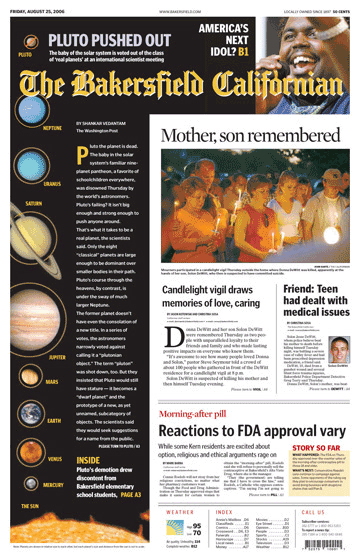
The Californian's redesign earned it a spot on Editor & Publisher's list of “Ten That Do it Right.” According to E&P, Bakersfield is appealing to its “really, really conservative market with a really, really radical redesign.”
And it’s working.
Circulation stops are down and revenue is up – over a thousand inches in the redesigned real estate section alone.
See before and after, see more pages and read the stories.
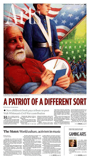
The Eureka (CA) Reporter was just a 6,000-circ. weekly in 2004. Our radical yet elegant redesign helped this startup weekly grow to a daily in less than two years. The Reporter goes head-to-head with an established daily owned by Dean Singleton, who told The San Francisco Chronicle last month that his competitor, “does some good design things.” The Society of News Design agrees – they cited this redesign as one of the best in the world. See more pages.
A new design to boost single-copy sales in a market where three papers go head-to-head>>
Do 6-column photos boost readership and revenue?>>
Who would have thought that TV books would lead to the end of newspapers as we know them?>>
Len Downie's memo calls for more emphasis on design.>>
Read our abbreviated version of API's report. It'll only take a minute and it's worth it.>>
See the charts that show why now is the time to redesign for revenue.>>
A practical, step-by-step approach with examples from newspapers large and small.>>
Learn from KnightRidder's mistakes at the Inky and the Merc.>>
This online redesign is not enough to please users and advertisers.>>
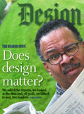
Design does matter to readers, but only if it's reader driven.>>
If newspaper markets are so different,
why do most papers look so much alike?>>
I wish you luck and offer some advice.>>
This overhyped trend is a non-starter for America.>>
We can make a difference, but not by chasing awards.>>
At stake is nothing less than newspapers as we know them.>>
A thousand awards a year? Gimme a break.>>
They never said higher RBS scores would sell more newspapers.>>


)
)
)
)
)
)
)
)