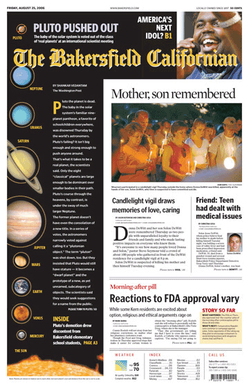
President Bush's speech dominated almost every front page today. This story presented a challenge to designers because the visuals were so lackluster. While most papers used the rather static image of Bush speaking into a TV camera, some papers dug deeper to find more creative solutions that told the story better.
Newsday used an image of the White House.
The Oregonian integrated an image of Bush with one of boots on the ground. The
Pioneer Press used lots of headlines to increase the visual appeal of their page while also informing.
Some headlines seemed to support the president, while others seemed skeptical. The Miami Herald said, "New Iraq plan, old doubts." Today's best headline was seen on the cover of
RedEye for a local story, "Stuck in L."
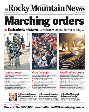
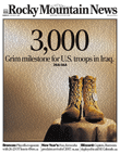
Most papers merely ran a photo and a column of text about the speech. But the Rocky Mountain News used a
short-form, alternate story-telling technique to present the information in a more efficient, easier-to-comprehend format. The
Republican-American used a similar strategy with bold, shallow horizontal images representing Bush, the troops and Congress.
The Rocky used no text on the cover. Instead, all the content was presented as bulleted items. Their headline was the shortest, boldest and most creative.
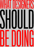
When newspapers lack for visuals, designers should use the words as visuals to make their pages more engaging. The notion that "every page needs a dominant image" is merely a myth.

• Agree, disagree or have a nomination for the next BFD?
Send it
• Recent standouts appear below.
See all


)
)
)
)
)