Let's get sticky
By Alan Jacobson, Brass Tacks Design
According to Wikipedia, "Sticky content refers to content published on a Web site, which has the purpose of getting a user to return to that particular Web site or hold their attention and get them to spend longer periods of time at that site."
In other words, visitors to sticky sites are more likely to click on internal links than external links, and less likely to visit a different site. This very narrow definition is important, because it can guide us to strategies for making sites stickier.
Now here's why stickiness should matter to every journalist – especially those who still think they work only for print:
Sticky sites serve up more pages than less-sticky sites. More pages provide more opportunities to serve up revenue-generating advertising – that's the bottom-line reason for pursuing stickiness and why it bears a systematic approach.
The obvious way to make a site more sticky is to provide links to related content on every page. But stickiness is not merely one-dimensional; it can be described and plotted along three axes: horizontal, vertical and diagonal:
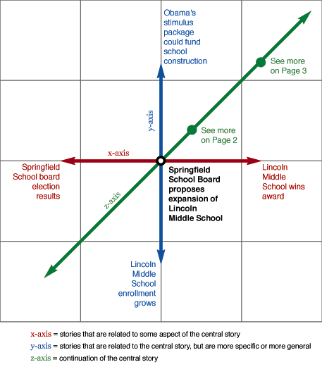
- The horizontal axis represents stories on related topics.
- The vertical axis represents stories that are either more general or more specific but on the same topic.
- The diagonal axis represents additional content without deviating from the topic (horizontal axis) or degree of specificity (vertical axis).
A story on a Web page can be plotted at the center of these three axes. Links that promote stickiness can be plotted as points some distance away from the center on all three axes. Plotting stories this way can serve several purposes, including: helping journalists to see the relative value between and among stories; and setting ad rates, so that stories plotted closer to the center-point could command higher rates.
Here's an example:
Story at the center-point: "Springfield School Board proposes expansion of Lincoln Middle School."
On the horizontal axis, links could include any stories about the Springfield School Board or the Lincoln Middle School. In the world of print, these stories might deserve a refer, such as "See related story." Links to more distantly related stories, such as stories about any school in Springfield, could also be included. These links would appear further away from the center-point if they were plotted on a chart.
On the vertical axis, links could include any content that is more specific, such as a chart showing the rise in enrollment at Lincoln Middle School or stories about deficiencies at the school; or links to stories that are less specific, such as national stories about school expansion, school enrollments or stories that show how communities can use Obama's proposed infrastructure-based stimulus package to pay for school expansion or refurbishment. In the world of print, these stories would be considered sidebars.
On the diagonal axis, links would include more information on the same topic and with the same level of specificity, such as quotes from teachers, parents, board members and school administrators. These links serve as a continuation of the story – like a "jump" in print – rather than a sidebar.
Breaking a story into two or more pages is one of the easiest ways to make a user's next click lead to an internal page, rather than an external one. News sites such as msnbc.com and nytimes.com have "continued" their stories onto a "next page" for some time. But nytimes.com hasn't done much to encourage users to click to the next page. In contrast, msnbc.com provides a subhead adjacent to the link to let the user know what is coming next.
To promote page views and stickiness on the diagonal axis, all stories should be segmented into multiple pages with subheads at every page break to encourage the next click. This will require reporters, who still focus on print, to write their stories with these breaks in mind and to punctuate each break with a subhead. This writing style may seem new to most reporters, but it was quite common just 50 years ago and can be seen on the front page of The New York Times even today. Ironically, this device doesn't appear at nytimes.com.
In other words, we need to teach the new dogs some old tricks. But this is merely one tactic. The entire stickiness strategy, and even the entire strategy of monetizing online journalism, requires a thorough exploration and explanation. Here's why:
News sites still depend upon print-centric reporters, photographers, artists and editors for content. These journalists must embrace strategies and tactics that can boost online revenue to pay the costs of their journalism. But journalists are a skeptical lot by temperament, and rightfully so. They require an explanation before they'll pursue any strategy – even strategies that are in the best interest of journalism and journalists.
So take heed ink-stained wretches – this may seem like TMI (too much information), but it's essential information for the future.