|
|
|
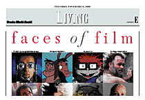
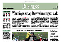
From SND’s’s Design Update , Fall 2002 Designing for readers How the Omaha World-Herald’s redesign changed their thinking By Ron Johnson, Kansas State University With state-of-the-art new presses but a 20-year old design, the Omaha World-Herald embarked upon a new design. The process produced a new look and a new outlook. Here is what they learned: Were the new presses the impetus for the redesign? Deanna Sands, managing editor and redesign-project leader: “The new presses and the new web width were the impetus for the redesign. We wanted the paper to look like an integrated whole rather than something that had been sized down as an afterthought. It was the right time to rethink our look and create features that would make the paper more useful to readers in 2001 and beyond.” How did World-Herald tradition affect the redesign? Sands: “We have intelligent, loyal readers who expect substance from their newspaper. We know from years of experience that they don't have much patience for frills.” “So we wanted a clean, organized and sophisticated look that still felt like the newspaper readers were accustomed to seeing each day — only better.” “We also needed a set of design tools that could stand up to the demands of producing five major editions each day. You can't get so cute that you can't get your newspaper produced on time.” What were your goals with the redesign? Jeff Carney, AME for graphics and photos: “We had some simple goals for our redesign: We wanted a better organized, more reader-friendly newspaper than we had before. We're a growing metropolitan area and we wanted a newspaper that reflected this fact.” “We also wanted to do a better job of organizing the newspaper for our readers. (Consultant) Alan Jacobson anchored our briefs packages on Page 2. Also on Page 2 we decided to anchor our jumps. This anchoring of elements forced a change in philosophy for us as well, as our cover stories all needed to fall under a length cap in order for the jumps to all land on Page 2.” “Alan also challenged us to think differently about our stories and their selection. Now we’re pulling out information or nuggets for fact boxes and summary leads. We’re giving each and every cover story multiple entry points, whenever possible. Everyone from the city desk to the copy desk is helping.” You selected one edition on which to build a prototype. How did you analyze content before building it? Joanne Stewart, assistant managing editor: “Our next step was a lively discussion about stories, focus for headlines and stories, reader-friendly elements to enhance stories, and selection and cropping of photos.” “We went through each section, deciding what readers wanted and in what form. (When the story was a public-policy issue that might not be the first thing a reader would gravitate to but was a story we believed the reader needed to be aware of, we talked about what we needed to do to better connect the reader to the story.)” “Alan poked at our selections, challenging every choice we made. We debated story length, writing style, headline approach…everything. Alan was forcing us to think like readers and to make decisions for readers, not for senior editors or reporters or anyone else.” “It was a difficult start…but it really set us on our course.” THE PAPER Omaha: Nebraska's largest city, and home of the College World Series. Circulation: 241,892 Sunday and 193,727 daily reaching every county in Nebraska and the western third of Iowa. THE NEW TOOLS Three MAN Roland Geoman 3/8 presses, with 18 towers and 99 couples, printing 75,000 copies an hour, with color on up to two-thirds of the pages and up to 12 sections ROP. And a new press facility, the $125 million Freedom Center, with a block-long transparent wall for downtowners to watch the press. THE PROJECT 50-inch web conversion and redesign of a 20-vear-old look launched Sept. 1, 2001, while producing five daily editions. THE LEADERS Deanna Sands, managing editor and redesign project leader Joanne Stewart, assistant managing editor supervising copy editors and paginators, and senior member on the prototype team Jeff Carney, AME for graphics and photos. Alan Jacobson, consultant MAJOR CONTENT CHANGES Anchored briefs and jumps on Page 2 of each section Business became its own section with redesigned agate Four new living sections and a redesigned entertainment section More reader service nuggets and fact boxes. THE MARCHING ORDERS Executive Editor Larry King: “Other than the flag, nothing is sacred.” THE LESSONS Training: Double the amount of training, no matter how much you think you've covered, it’s never enough. Focus: Keep focused on readers. Everybody in the newsroom has an opinion, but you're putting the paper out for people who read it. Debate: Discuss everything: Story length, writing style, headline approach. Watch the details: Watch out for excessive tinkering. You can still foster a lot of creativity within well-defined parameters. Innovate: Think differently about stories and their selection. Pull out information. Prepress: Pay attention to prepress issues. It you're getting a new press, your staff needs to break old habits and learn new color standards. If you are redesigning but keeping the same press, make sure that your vision will hold up against production realities. Test: Test everything. THE RESPONSE “Overall it's been positive…Readership has improved in the past year. I’d like to think it was solely because of the redesign but that’s probably not the case. Remember that 9/11 came only 10 days after we launched and changed everything. Football season didn’t hurt either.” |
|