For most designers, a newspaper is typography, grids, images, color palettes, etc.
But ask a designer from The Dallas Morning News, or Los Angeles Times or Akron Beacon-Journal or the former KnightRidder, and they'll tell you that newspapers are all about numbers: buyouts, layoffs, staff reductions, newshole cuts and declining stock valuations.
It's these all-important numbers that drove Editor Cate Brett of the Sunday Star-Times in Auckland, New Zealand to consider a redesign. She "didn't give a toss" for a color palette that was in harmony with the community or typography that evoked a bygone era or even story-telling devices. She just needed to sell more newspapers.
The numbers
The Star-Times is New Zealand's best newspaper. It publishes 200,000 each Sunday to serve both islands of this tiny, South Pacific nation of 4 million. With more than half a million readers, the Star-Times reaches 1 in 8 Kiwis - as New Zealanders call themselves.
 One-in-eight penetration makes the Star-Times a powerful force in New Zealand. How does this compare to the United States? The closest thing we have to a national, general interest newspaper is USA Today - with 2 million circulation and roughly 5 million readers in a nation of 300 million. So USA Today reaches 1 in 60 Americans, while the Star-Times has more than 7 times that penetration in its country.
The Star-Times is big in New Zealand. Really big, as in almost 15 inches wide - putting the broad in broadsheet. Unlike America's ever-narrowing papers that average 11.5 inches wide (in two years, The new New York Times and The Wall Street Journal will be narrower still), the SST is literally a handful. Imagine holding a yard stick at arm's length - that's what it feels like when you open the Star-Times.
But being biggest and best is rarely enough to satisfy the proprietors. They count on results they can count - circulation.
The challenge
For years, the SST reigned as the only, national, quality Sunday newspaper. The only other paper of consequence was the Sunday News, a downscale tabloid similar to the National Enquirer. (A recent front-page headline: "FRIEND OR UFO?")
 But two years ago the SST's monopoly on serious Sunday readership was challenged by the Herald on Sunday, a new edition of the New Zealand Herald. Before launching the HoS (Herald on Sunday), The Herald published six days a week, covering both Saturday and Sunday with the Weekend Herald on Saturday. They left Sunday to the SST and the Sunday News.
The new Herald on Sunday was brilliant in every way. They sought to siphon off serious readers of the SST by leveraging their established weekday Herald brand of quality journalism. But the HoS was not just another day's edition of the Herald in a more convenient tabloid format. The HoS is "tabloid" in both form and content, adopting screaming headlines that oversold their stories. As a result, the HoS is more exciting to look at and easier to hold than the broadsheet SST.
And the HoS didn't stop with form and content. These cheeky devils invested in point-of-sale merchandising, front-page giveaways (WIN A TRIP TO FUJI!) and discounts to Herald subscribers that allowed them to receive the Herald on Sunday for next to nothing.
 Their efforts reduced the sales of the Star-Times, to the tune of 20,000 papers or 10% of their total circulation.
What they have in New Zealand is a real newspaper war, unlike anything we have in the States. Granted, a handful of American cities have competing dailies, but most of them are Joint Operating Agreements. JOAs provide for journalistic competition without financial consequences - profits for both papers are guaranteed. Not much sport in that.
These Kiwi newspapers differ from stateside papers in yet one more important way - 70% of their circulation comes from retail sales, rather than subscriptions. In the U.S, most papers get almost 80% of their circulation from subscriptions. So single-copy sales are more than important to papers in New Zealand - they're life and death.
It's easy for serious journalists and newspapers designers to dismiss the bombast of the Sunday News and the HoS. But the Sunday Star-Times could not afford to ignore their impact on its circulation. What they needed was a design that leveraged their superior content but competed more effectively on the newsstand. It's on the newsstand where the tabs have an advantage because their format lends itself more readily to the poster-style presentation needed to attact single-copy purchasers.
The beginning
If you want to sell more newspapers, you go to where people by them. So off I went with Retail Manager Michael Pluck (and quite the plucky chap he is!) to see the paper the way the retail purchasers see it - in the supermarket on the newsstand cheek-by-jowl with the Sunday News and Herald on Sunday.
The nameplate
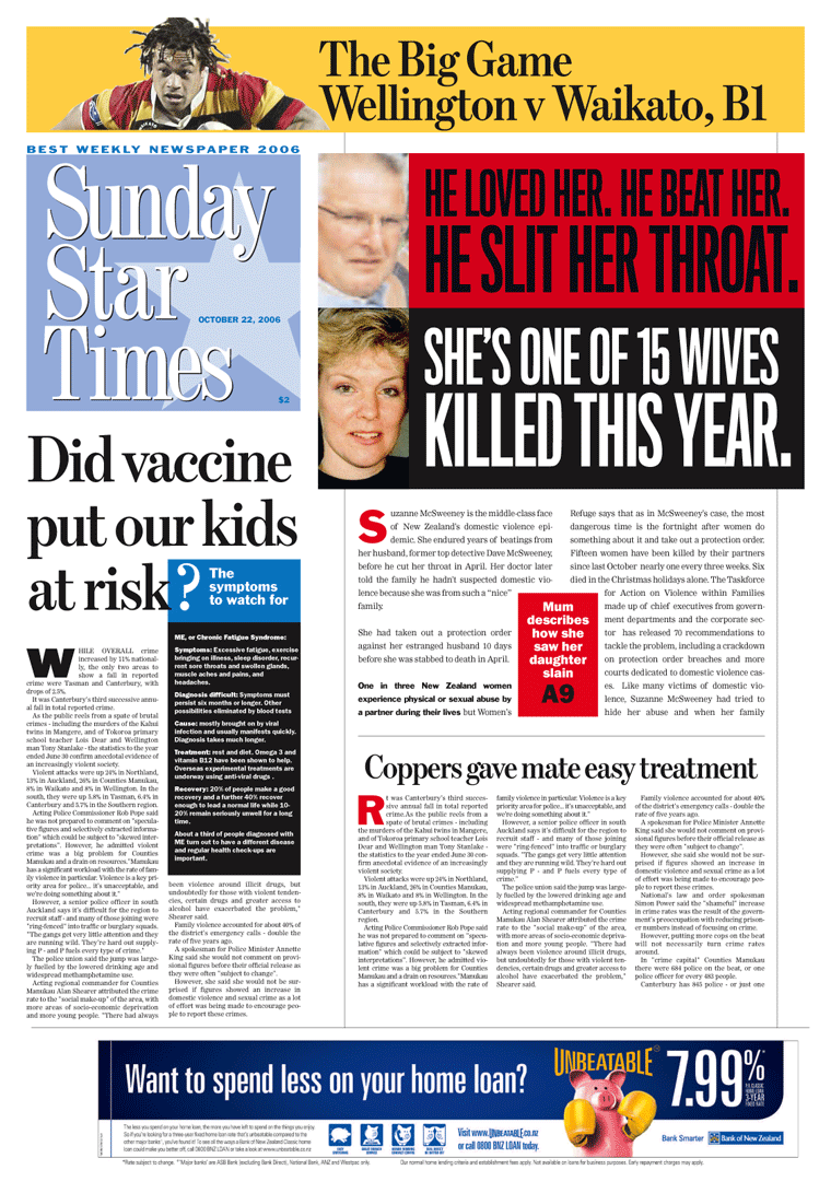
The first thing you see when you look at the Sunday Star-Times is it's nameplate. At two inches deep and almost 15 inches wide it consumes a much larger portion of the paper's above-the-fold presence than either of its competitors. With their smaller nameplates, both the Sunday News and Herald on Sunday have more room for above-the-fold content. So I created a new nameplate by shortening the name of the paper to Star Times. Star Times' designer Voyteck Grzymala went a step further with a nameplate that stacked the newspaper's name in a square block. Both nameplates had more impact while making more room above-the-fold space for content.
Author's note: This redesign truly spanned the globe - with me from the States, Voyteck from Poland and my South Pacific hosts representing generations of British immigrants and the indigenous Maori tribes of New Zealand.
The drivers
This redesign was about selling more newspapers. Period. If it didn't sell more newspapers, it would be a failure, no matter how elegant and sophisticated it looked. So we set out to learn what drives impulse buyers. Here's the hierarchy of factors, in order:
1. Content selection
2. Headlines
3. Images
4. Element count
1. Content selection: First and foremost, you must put the right content above the fold, even when that "content" is "FREE FLIGHTS - 8 HOLIDAY ESCAPES."
To be effective, content must be relevant, compelling and interesting, with relevance being the most critical. For instance, a story about rising residential home values in the HoS ("HOW YOUR HOME HAS FARED") sold better than a story in the SST about a mother seeing her daughter run down and killed by a truck as she got off a school bus. Even though the daughter's death was news and compelling, it was not as relevant to the thousands who wanted to learn how much more their home was worth.
Notably, "importance" is not as effective as a driver as relevant, compelling or interesting.
2. Headlines: Second, you need the right headlines. Label heads don't sell. "Clever" heads don't sell. Heads with too many words don't sell. Heads without verbs don't sell. Heads reversed out of color photos don't sell as well as those that print more clearly. The strongest, shortest, most direct and legible heads sold best.
"Homeowners hit with new bombshell" sells better than "Into the light."
3. Images: I had hoped to make dramatic use of images a cornerstone of this redesign, but alas, our research showed that headlines were more important to impulse buyers than even the most compelling images. The redesign does ratchet up the use of images, but we learned to hone our headlines to sell more papers.
4. Element count: Contrary to the conventional wisdom, increasing the element count above the fold does not improve single-copy sales. In fact, too many elements may prove detrimental. Impulse buys are driven by primary or secondary content, not tertiary elements. Is it any wonder that the HoS's front page is dominated by two almost identically sized elements?
The people
The best part of this project has been the people I worked with in New Zealand. I've never met a more fun-loving, positive, gung-ho, newspaper-loving lot. Never a discouraging word I heard - a far cry from all the whining you hear in American newsrooms.
Here's an example: I arrived in Auckland at 5:15 AM at the end of a 25 hour trip. After I short nap, I rang up Cate who wisked me off to lunch and then to the newsroom and the budget meeting for tomorrow's paper. Just for fun, I began sketching some options on my laptop for a front-page package on increases in crime throughout New Zealand. None of the editors was sold on the design they had planned and preferred my sketch, saying "Let's do that instead."
I was quick to point out that they didn't have my fonts, that I hadn't tested these colors on their press and that all the images were low resolution. I told them I didn't think it was a good idea to try this on deadline.
Graphics editor Dave MacKay said, "No worries, mate. Let me have a go at it."
And he did.
The next day's paper contained my first bit of design for the Sunday Star-Times. And as I feared, it looked like...a dog's breakfast. But there no complaints, no recriminations. Nothing but a undaunted spirit of progress that characterized every step of this redesign.
The process
Voyteck and I spent a couple days building new front page formats based on previously published editions. Each prototype was different but all shared the common goal of promoting the paper's best stories on the newsstand. Later that week we tested four front pages against editions of the Sunday News and the HoS. Not surprisingly, loyal readers of the SST were more comfortable with the current design. But "switchers" - those who bought either the HoS or Star-Times - were attracted to the prototypes.
Section fronts were redesign to reflect changes to the new nameplates and the addition of Titling Gothic from The Font Bureau for display heads. Design Editor Lisa Bradley tackled the inside pages. There wasn't enough time to change formats on the Cybergraphic system, so Lisa had to make do with the existing typography.
And make do she did. With the mere addition of white space and a more robust ruling system, she managed to reduce the ponderousness of the "mile-wide" broadsheet pages - oops, I mean kilometer-wide for you Kiwis.
Lisa's work was part of our overall strategy to help sell more newspapers. We need to improve the inside pages to counter the HoS's inherently more reader-friendly tab-sized pages.
At the end of my week on site, I "shadowed" the news operation and produced a proof-of-concept front page in the format of the new design while they worked on the front page for publication.
We accomplished a great deal in one week's time - creating a new front page design, testing it with readers and test-driving it on deadline. There was more work to be done to make this redesign a reality, but my week on site was over. So we decided to continue the process using a novel approach to producing the front page: Cate & Co. would send me their story budget, images and layouts via email. I would respond with suggestions on their content and design in real time.
The SST is produced using a proprietary Cybergraphic system that was impossible to replicate in our Virginia offices. But we both had QuarkXPress, so it became our common platform. XPress made it possible to produce front pages in real time half-a-world apart.
We weren't ready to launch the new design - we were waiting for approval to change the nameplate and we didn't know which version we would change it to, if it all - but as is always the case with my can-do Kiwi colleagues, they wouldn't let this hurdle prevent them from selling more newspapers. So we decided to push ahead with the current nameplate but use the new design philosophy for front page content.
Working collaboratively via email seems like a reasonable proposition until you consider the 16-hour time difference between Auckland, NZ and Norfolk, VA. The Kiwis begin work on their front page at 9 AM Saturday (5 PM Friday my time) and continue through 10 PM (6 AM Saturday my time). The rate of emails between Norfolk and Auckland would begin slowly, but reach a furious pace in the wee hours as I responded to changing content from Cate, her deputies and assistants, picture editors, graphics editors and designers.
As if often the case at most newspapers, our best designs were often scrapped as the front-page lineup changed. This frequently happened as I was padding off to bed at 3 AM so much of my work never saw publication. But our round-the-world-in-real-time effort was intended to be more of a training exercise than a circulation-boosting effort. If we sold more papers in the process, all the better.
 And we did sell more papers. On August 19, we produced a front page topped with a startling JonBenet photo-illustration and sales jumped 6%. This page used the old nameplate and typography but reflected our bolder approach to design and content. It confirmed our belief that compelling content presented in a compelling way will produce bottom-line results.
The two nameplates
The launch date was only weeks away and we still had no decision on the nameplate. I counseled for the more conservative of the two versions. Then I received this surprising email from Cate:
"The decision has been made to take a bold step into the future and go with the square nameplate. There's certainly a little more risk attached to going this way but I also think there is potentially more gain - it feels to me like the choice for a paper that knows who it is and is not afraid to take the next step."
Based on my experience with Cate, I shouldn't have been surprised by her decision. She's an editor in the grand, British tradition of editors with vision.
This kind of courage is rare. The last time I saw such a bold move was when Bakersfield Californian CEO Richard Beene and Executive Editor Mike Jenner launched their radical redesign in March. Their determination and leadership earned them a spot on Editor and Publisher's list of "Ten That Do It Right."
The launch Today is Friday, September 22. The new design will debut this Sunday. Only time will tell whether this redesign will make a difference as we await the verdict of the readers and the marketplace. In the meantime, I'm putting coffee on. I'll be up all night to help my friends birth their baby.
My time in paradise New Zealand is a land of breath-taking beauty. That's why movie director Peter Jackson chose it as the setting for his Lord of the Rings trilogy. But I saw nothing of it – I was having too much fun working with Cate, Donna, Miri, Lois, Lisa & Lisa, Neville, Dave, Voyteck and Michael Pluck (What a treat he was!)
When I got back to the States, everyone asked me how I enjoyed my time in paradise. I said, "It was great. I never left the office."
But ask a designer from The Dallas Morning News, or Los Angeles Times or Akron Beacon-Journal or the former KnightRidder, and they'll tell you that newspapers are all about numbers: buyouts, layoffs, staff reductions, newshole cuts and declining stock valuations.
It's these all-important numbers that drove Editor Cate Brett of the Sunday Star-Times in Auckland, New Zealand to consider a redesign. She "didn't give a toss" for a color palette that was in harmony with the community or typography that evoked a bygone era or even story-telling devices. She just needed to sell more newspapers.
The numbers
The Star-Times is New Zealand's best newspaper. It publishes 200,000 each Sunday to serve both islands of this tiny, South Pacific nation of 4 million. With more than half a million readers, the Star-Times reaches 1 in 8 Kiwis - as New Zealanders call themselves.
 One-in-eight penetration makes the Star-Times a powerful force in New Zealand. How does this compare to the United States? The closest thing we have to a national, general interest newspaper is USA Today - with 2 million circulation and roughly 5 million readers in a nation of 300 million. So USA Today reaches 1 in 60 Americans, while the Star-Times has more than 7 times that penetration in its country.
The Star-Times is big in New Zealand. Really big, as in almost 15 inches wide - putting the broad in broadsheet. Unlike America's ever-narrowing papers that average 11.5 inches wide (in two years, The new New York Times and The Wall Street Journal will be narrower still), the SST is literally a handful. Imagine holding a yard stick at arm's length - that's what it feels like when you open the Star-Times.
But being biggest and best is rarely enough to satisfy the proprietors. They count on results they can count - circulation.
The challenge
For years, the SST reigned as the only, national, quality Sunday newspaper. The only other paper of consequence was the Sunday News, a downscale tabloid similar to the National Enquirer. (A recent front-page headline: "FRIEND OR UFO?")
 But two years ago the SST's monopoly on serious Sunday readership was challenged by the Herald on Sunday, a new edition of the New Zealand Herald. Before launching the HoS (Herald on Sunday), The Herald published six days a week, covering both Saturday and Sunday with the Weekend Herald on Saturday. They left Sunday to the SST and the Sunday News.
The new Herald on Sunday was brilliant in every way. They sought to siphon off serious readers of the SST by leveraging their established weekday Herald brand of quality journalism. But the HoS was not just another day's edition of the Herald in a more convenient tabloid format. The HoS is "tabloid" in both form and content, adopting screaming headlines that oversold their stories. As a result, the HoS is more exciting to look at and easier to hold than the broadsheet SST.
And the HoS didn't stop with form and content. These cheeky devils invested in point-of-sale merchandising, front-page giveaways (WIN A TRIP TO FUJI!) and discounts to Herald subscribers that allowed them to receive the Herald on Sunday for next to nothing.
 Their efforts reduced the sales of the Star-Times, to the tune of 20,000 papers or 10% of their total circulation.
What they have in New Zealand is a real newspaper war, unlike anything we have in the States. Granted, a handful of American cities have competing dailies, but most of them are Joint Operating Agreements. JOAs provide for journalistic competition without financial consequences - profits for both papers are guaranteed. Not much sport in that.
These Kiwi newspapers differ from stateside papers in yet one more important way - 70% of their circulation comes from retail sales, rather than subscriptions. In the U.S, most papers get almost 80% of their circulation from subscriptions. So single-copy sales are more than important to papers in New Zealand - they're life and death.
It's easy for serious journalists and newspapers designers to dismiss the bombast of the Sunday News and the HoS. But the Sunday Star-Times could not afford to ignore their impact on its circulation. What they needed was a design that leveraged their superior content but competed more effectively on the newsstand. It's on the newsstand where the tabs have an advantage because their format lends itself more readily to the poster-style presentation needed to attact single-copy purchasers.
The beginning
If you want to sell more newspapers, you go to where people by them. So off I went with Retail Manager Michael Pluck (and quite the plucky chap he is!) to see the paper the way the retail purchasers see it - in the supermarket on the newsstand cheek-by-jowl with the Sunday News and Herald on Sunday.
The nameplate
The first thing you see when you look at the Sunday Star-Times is it's nameplate. At two inches deep and almost 15 inches wide it consumes a much larger portion of the paper's above-the-fold presence than either of its competitors. With their smaller nameplates, both the Sunday News and Herald on Sunday have more room for above-the-fold content. So I created a new nameplate by shortening the name of the paper to Star Times. Star Times' designer Voyteck Grzymala went a step further with a nameplate that stacked the newspaper's name in a square block. Both nameplates had more impact while making more room above-the-fold space for content.
Author's note: This redesign truly spanned the globe - with me from the States, Voyteck from Poland and my South Pacific hosts representing generations of British immigrants and the indigenous Maori tribes of New Zealand.
The drivers
This redesign was about selling more newspapers. Period. If it didn't sell more newspapers, it would be a failure, no matter how elegant and sophisticated it looked. So we set out to learn what drives impulse buyers. Here's the hierarchy of factors, in order:
1. Content selection
2. Headlines
3. Images
4. Element count
1. Content selection: First and foremost, you must put the right content above the fold, even when that "content" is "FREE FLIGHTS - 8 HOLIDAY ESCAPES."
To be effective, content must be relevant, compelling and interesting, with relevance being the most critical. For instance, a story about rising residential home values in the HoS ("HOW YOUR HOME HAS FARED") sold better than a story in the SST about a mother seeing her daughter run down and killed by a truck as she got off a school bus. Even though the daughter's death was news and compelling, it was not as relevant to the thousands who wanted to learn how much more their home was worth.
Notably, "importance" is not as effective as a driver as relevant, compelling or interesting.
2. Headlines: Second, you need the right headlines. Label heads don't sell. "Clever" heads don't sell. Heads with too many words don't sell. Heads without verbs don't sell. Heads reversed out of color photos don't sell as well as those that print more clearly. The strongest, shortest, most direct and legible heads sold best.
"Homeowners hit with new bombshell" sells better than "Into the light."
3. Images: I had hoped to make dramatic use of images a cornerstone of this redesign, but alas, our research showed that headlines were more important to impulse buyers than even the most compelling images. The redesign does ratchet up the use of images, but we learned to hone our headlines to sell more papers.
4. Element count: Contrary to the conventional wisdom, increasing the element count above the fold does not improve single-copy sales. In fact, too many elements may prove detrimental. Impulse buys are driven by primary or secondary content, not tertiary elements. Is it any wonder that the HoS's front page is dominated by two almost identically sized elements?
The people
The best part of this project has been the people I worked with in New Zealand. I've never met a more fun-loving, positive, gung-ho, newspaper-loving lot. Never a discouraging word I heard - a far cry from all the whining you hear in American newsrooms.
Here's an example: I arrived in Auckland at 5:15 AM at the end of a 25 hour trip. After I short nap, I rang up Cate who wisked me off to lunch and then to the newsroom and the budget meeting for tomorrow's paper. Just for fun, I began sketching some options on my laptop for a front-page package on increases in crime throughout New Zealand. None of the editors was sold on the design they had planned and preferred my sketch, saying "Let's do that instead."
I was quick to point out that they didn't have my fonts, that I hadn't tested these colors on their press and that all the images were low resolution. I told them I didn't think it was a good idea to try this on deadline.
Graphics editor Dave MacKay said, "No worries, mate. Let me have a go at it."
And he did.
The next day's paper contained my first bit of design for the Sunday Star-Times. And as I feared, it looked like...a dog's breakfast. But there no complaints, no recriminations. Nothing but a undaunted spirit of progress that characterized every step of this redesign.
The process
Voyteck and I spent a couple days building new front page formats based on previously published editions. Each prototype was different but all shared the common goal of promoting the paper's best stories on the newsstand. Later that week we tested four front pages against editions of the Sunday News and the HoS. Not surprisingly, loyal readers of the SST were more comfortable with the current design. But "switchers" - those who bought either the HoS or Star-Times - were attracted to the prototypes.
Section fronts were redesign to reflect changes to the new nameplates and the addition of Titling Gothic from The Font Bureau for display heads. Design Editor Lisa Bradley tackled the inside pages. There wasn't enough time to change formats on the Cybergraphic system, so Lisa had to make do with the existing typography.
And make do she did. With the mere addition of white space and a more robust ruling system, she managed to reduce the ponderousness of the "mile-wide" broadsheet pages - oops, I mean kilometer-wide for you Kiwis.
Lisa's work was part of our overall strategy to help sell more newspapers. We need to improve the inside pages to counter the HoS's inherently more reader-friendly tab-sized pages.
At the end of my week on site, I "shadowed" the news operation and produced a proof-of-concept front page in the format of the new design while they worked on the front page for publication.
We accomplished a great deal in one week's time - creating a new front page design, testing it with readers and test-driving it on deadline. There was more work to be done to make this redesign a reality, but my week on site was over. So we decided to continue the process using a novel approach to producing the front page: Cate & Co. would send me their story budget, images and layouts via email. I would respond with suggestions on their content and design in real time.
The SST is produced using a proprietary Cybergraphic system that was impossible to replicate in our Virginia offices. But we both had QuarkXPress, so it became our common platform. XPress made it possible to produce front pages in real time half-a-world apart.
We weren't ready to launch the new design - we were waiting for approval to change the nameplate and we didn't know which version we would change it to, if it all - but as is always the case with my can-do Kiwi colleagues, they wouldn't let this hurdle prevent them from selling more newspapers. So we decided to push ahead with the current nameplate but use the new design philosophy for front page content.
Working collaboratively via email seems like a reasonable proposition until you consider the 16-hour time difference between Auckland, NZ and Norfolk, VA. The Kiwis begin work on their front page at 9 AM Saturday (5 PM Friday my time) and continue through 10 PM (6 AM Saturday my time). The rate of emails between Norfolk and Auckland would begin slowly, but reach a furious pace in the wee hours as I responded to changing content from Cate, her deputies and assistants, picture editors, graphics editors and designers.
As if often the case at most newspapers, our best designs were often scrapped as the front-page lineup changed. This frequently happened as I was padding off to bed at 3 AM so much of my work never saw publication. But our round-the-world-in-real-time effort was intended to be more of a training exercise than a circulation-boosting effort. If we sold more papers in the process, all the better.
 And we did sell more papers. On August 19, we produced a front page topped with a startling JonBenet photo-illustration and sales jumped 6%. This page used the old nameplate and typography but reflected our bolder approach to design and content. It confirmed our belief that compelling content presented in a compelling way will produce bottom-line results.
The two nameplates
The launch date was only weeks away and we still had no decision on the nameplate. I counseled for the more conservative of the two versions. Then I received this surprising email from Cate:
"The decision has been made to take a bold step into the future and go with the square nameplate. There's certainly a little more risk attached to going this way but I also think there is potentially more gain - it feels to me like the choice for a paper that knows who it is and is not afraid to take the next step."
Based on my experience with Cate, I shouldn't have been surprised by her decision. She's an editor in the grand, British tradition of editors with vision.
This kind of courage is rare. The last time I saw such a bold move was when Bakersfield Californian CEO Richard Beene and Executive Editor Mike Jenner launched their radical redesign in March. Their determination and leadership earned them a spot on Editor and Publisher's list of "Ten That Do It Right."
The launch Today is Friday, September 22. The new design will debut this Sunday. Only time will tell whether this redesign will make a difference as we await the verdict of the readers and the marketplace. In the meantime, I'm putting coffee on. I'll be up all night to help my friends birth their baby.
My time in paradise New Zealand is a land of breath-taking beauty. That's why movie director Peter Jackson chose it as the setting for his Lord of the Rings trilogy. But I saw nothing of it – I was having too much fun working with Cate, Donna, Miri, Lois, Lisa & Lisa, Neville, Dave, Voyteck and Michael Pluck (What a treat he was!)
When I got back to the States, everyone asked me how I enjoyed my time in paradise. I said, "It was great. I never left the office."